A Room With A View
text by Larry Storer | photography by Garen Hagopian
Poured-in-place mid-century modern home is at peace with its surroundings
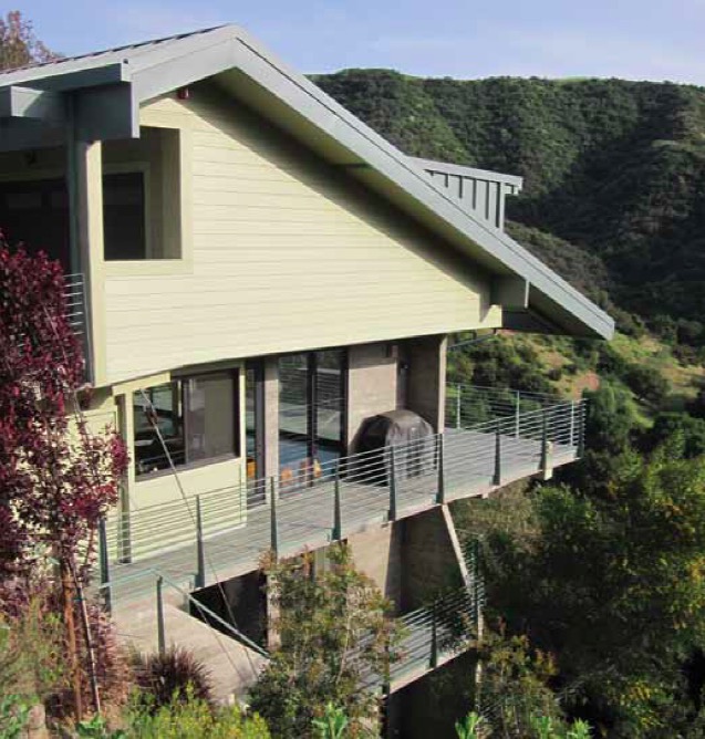
Aptly called the Hillside Sanctuary, a poured-in-place concrete mid-century modern home nestles serenely into the side of a hill in Glendale, Calif., providing unobstructed amazing views of Glendale’s rolling hills. Careful space planning allowed the architect, Art T. Simonian, to fit three bedrooms, two and a half bathrooms, and a home office into this concrete home.
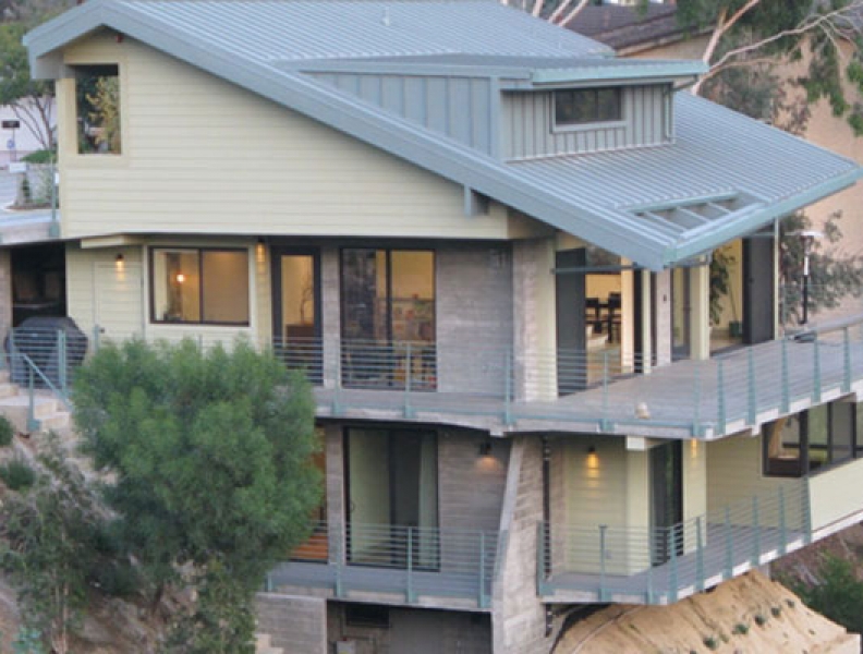
The warm gray, board-formed exposed exterior concrete walls, moss green horizontal siding and a hemlock-green metal roof help this home look as if it has been a part of the hillside forever.
With California’s emphasis on environmental and sustainable concerns, Simonian had to be a good steward of the land in order to get the building permits for this home in which he now lives.
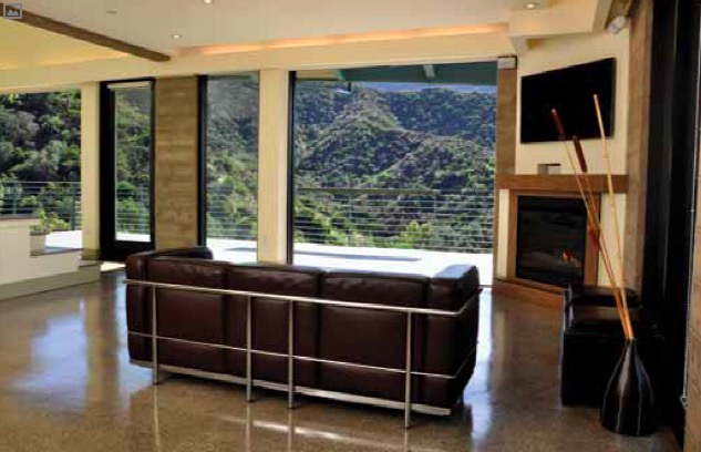
His attention to environmental concerns and natural finishes has resulted in a home that literally merges with the outdoors. Not only is the view unbelievable from virtually any location in the house, but the massive floor-to-ceiling storefront window system and the multi-slide glass pocket doors (that can be opened and hid-den) open the home’s interior to a 12-foot-deep deck of more than 500 square feet of outdoor living space off the living room, dining room and kitchen.
It took five years from the planning to completion of the house, but little was easy along the way.
LOCATION, LOCATION, LOCATION
While Simonian knew he wanted a modern mid-century home, he said he didn’t know how badly he wanted to build it until he found this site. The hillside itself has about a 60-percent slope with an unobstructed view of the mountains.
“It’s fairly unusual in Los Angeles to have an unobstructed mountain view,” Simonian said. “There’s always something that you look on to. When we came across this site we fell in love with it immediately because of the view.”
The downward slope lot itself is small – about 6,200 square feet – and access is from a street that is neither long nor wide. In order to build on this site, Simonian needed a variance and two conditional use permits.
Simonian is not only a licensed architect who owns his own company, Simonian & Associates, he also owns Metro Investments LLC, a real estate development company. And even with his complete knowledge of the homeowner’s association requirements and the city’s zoning and building requirements, permitting for this project still took several years to complete.
“In Southern California there’s always a resistance to development, and that resistance gets amplified as one starts to go into the mountains,” Simonian explained. “The mountains in Southern California are sacred, as you can imagine. Southern California culture is based on outdoor activities and so there are a lot of hikers, a lot of individuals in the community who spend a lot of time outdoors.
“With that comes a lot of protectionism of the hill-sides. One cannot develop on the primary ridges and seldom on the secondary ridges. But even on the tertiary or not so substantial ridges, one has to go through some very strict processes to be able to obtain a permit and approvals.”
BLENDING INTO THE HILLSIDE
The house is not large and dominating, and it’s by design that the house blends smoothly into the surrounding hill-side. It terraces up the hill as you go from the bottom to the street level, and the steep roof slopes down and mimics the natural contours of the land.
“And what this created,” he said, “is a home that is in harmony with its surrounding as opposed to creating mass and bulk. The idea was not to create mass or bulk, but to integrate into the hillside, and that was achieved.”
Simonian said they took this natural motif to the Nth degree. “I mean we even used natural colors of the surrounding hillside and integrated them into the design material board. So we have a moss-green colored horizontal siding, a hem-lock-green metal roof and the warm gray of the concrete.
“Inside we have materials that mimic the natural land-scape, and so as the seasons change, as the colors change around us, different colors start popping out in the interior and could be distinguished on the outside as well.”
DESIGN PARAMETERS
In addition to blending into the hillside, another of the design parameters was to create an indoor and outdoor integration. “Out here in Southern California, outdoor living areas are just as important as indoor living areas, and so that was the main project focal point. This required large decks for outdoor living, and Simonian designed outdoor living as a part of the house.
“I actually built this as my primary residence. I was the client and had the luxury of making all the decisions and doing as I please without someone dictating where I should put something or design according to someone else’s ideas. That’s the best of all worlds.
“Another design intent was to utilize the view as much as possible and to really create viewing points from every corner of the house,” Simonian explained. We wanted to see the mountains from every corner and that was one of the main things that was achieved. We also wanted to have an open floor plan in order to go with the mid-century motif.
“When starting the design process, we were not set on utilizing only a concrete construction methodology, but as we starting going over all the ‘must-have’ items in the house, they all pointed toward the concrete structure. The only way we could do everything we wanted to do was with concrete.
“It just occurred to us, ‘gosh, we’ve got to go down the road as a concrete building because that’s the only way we were going to achieve all these design and performance factors.’”
Also, the only way that the house could have a 12-foot by 45-foot cantilever deck right off the living area was with concrete. And the only way it could have its open-area concept with no load-bearing walls was with concrete.
“There are no load-bearing walls inside,” Simonian said. “There is just one column, and all the shear-walls are on the perimeters of the home; just one simple concrete column right in the open living plan, which we’ve used as a design opportunity for stairs.
“We utilized concrete decks and were able to have huge 12-foot cantilevers, and by doing so we were able to create large outdoor living areas.
The lowest level of the house is the bedroom level. The second level with a deep overhang is the living level, which includes the living room, kitchen and dining room.
The top-level garage is actually tucked into a dormer that pops out of the home’s roof. The garage dormer, similar to the whole house in style, makes use of every available square inch. The roof is steep with a 5.5/12 pitch, but the required height clearance above the hood of the car is achieved by the integration of the dormer. Closer to the street there’s an opening underneath the driveway, so the driveway functions like a floating bridge.
“If you can imagine that home without that slanted roof, it would seem extremely bulky and extremely massive; but once we were able to slant the angle of the roof down to mimic the natural contours of the surrounding landscape, the home all of the sudden was much less bulky in size.”

CONCRETE AS AN ART FORM
“There is a certain very organic element with a warm feel of board-formed poured-in-place concrete,” Simonian said.
Not only does board-formed methodology produce amazing but subtle horizontal lines, it also creates a concrete wall with texture. And once this concrete wall is stained with some sort of a natural hue, it becomes somewhat like a sculptural piece.”
The project required additional coordination with the con-crete tradesman from Gabor Horanyi Concrete out of North-ridge, Calif., because their usual work is pouring walls that are going to be veneered over or finished with thin rock or brick. This was an unusual project that required extra finesse.
“There is such a level of complexity and detail that comes along with having board-formed poured concrete, but once it is done it’s an amazing look,” Simonian said. “You can tell its masonry or tell it’s concrete, but it has such a warm look to it. We decided to go with the methodology in order to get this look and because we wanted to expose it on the inside and on the outside as well.
When the 2×8 board forms are set up, there is a 3-16th inch spacing gap that is maintained. As the concrete is poured in the pockets between the two board forms, con-crete drips a little bit into that 3-16th inch gap so that when the forms are removed, there are these horizontal lines that come up every 8 inches as you go across the wall. At the same time, the texture of the wood gets transposed onto the concrete.
“When we looked at it from a holistic point of view, we said, ‘OK, if we had gone with steel construction or wood construction, we still would have to cover the exterior and the interior walls, so that would have been an additional cost.’
“But exactly how much is hard to compare because that look you are getting with the board-formed concrete is so different from the look you would get with any other con-crete system. So it’s almost like you are getting your finishing out of the way as you progress in the construction.”
There is about 525 cubic yards of 4,000 psi concrete in the project.
Simonian wanted an exposed concrete look on the con-crete floor slabs, so they sprinkled natural colored gravel on top of the concrete slab pour. “Then afterwards when we grinded the floors, the amazing colors and textures of the gravel just popped out – it’s almost like a terrazzo look.
“On the exposed exterior concrete walls we didn’t do anything special. It was just regular 4,000 psi concrete, but the concrete color is a warm gray, as opposed to a cool gray. On the interior exposed concrete walls, we went ahead and applied a concrete stain and sealer, which provided us with a very rich and warm color finish.”
The floor system is a poured-in-place one-way concrete slab system. “We were going to utilize a two-way concrete slab system, but structurally there were chal-lenges because the slab had too many cut outs or openings,” Simonian explained. “So we couldn’t go with a more efficient two-way system.
“There are three concrete beams that are monolithically poured with the concrete slab. The concrete beams are 8 inches wide and line up with the 8-inch bearing concrete walls.”
Rebar No. 10 is used in the concrete beams supporting the floors. All walls used No. 6, 12 inches on center, and No. 5 horizontally, 16 inches on center. The 8-inch retaining walls had added steel on the bottom, because they also work like beams.
Structural engineer Ed Babayan & Associates out of Glen-dale value-engineered this house so that it sits on only eight piles plus three footings, which is very efficient. Because of the square configuration of the design, Babayan was really able to push the boundary as far as utilizing the least number of piles.
“Babayan was a crucial part of design team,” Simonian said. “He was able to roll up his sleeves and accommodate everything we asked of him from the overhangs to the simplicity of the structure to reducing the number of piles.”
Because the grade beams were concrete, because the floor slabs were concrete, and because all the shear walls and columns and slabs going all the way up were concrete, it worked as a complete system top-to-bottom.
The retaining walls that were also anchored into the earth further increased the efficiency value of the home be-cause the retaining walls actually became beams themselves because of the way they had laid in the steel.
Concrete construction took more than a year, which Simonian said is not atypical for custom hillside homes in Southern California; however, the concrete foundation and structure for walls and floor slabs – especially being poured-in-place – did slow down the construction schedule. “But we knew that going in,” he said.
“It just takes a long time to form these things. It takes a long time to be sure all your lines are horizontal and all your board-form lines match up, and all your boards are good quality wood so your textures will come out the way you want it.
“This is just a level of detail that extends the construction time. The concrete itself took 14 months from drilling the first pile to finishing out the last deck (garage level).”
As the crews moved up a level, the subs were already in on the lower levels, putting in the interior walls, and the plumbing and electrical systems. It was staged like a larger project with different trades working at different levels of the home.
Mid-century architecture is a further development of Frank Lloyd Wright’s principles of organic architecture, which generally describes mid-20th century developments in modern design, architecture, and urban development from roughly 1933 to 1965. It is characterized in part by open formats and harmony between human habitation and the natural world through design approaches so well integrated with its site that buildings, furnishings and surroundings become part of a unified, interrelated composition.
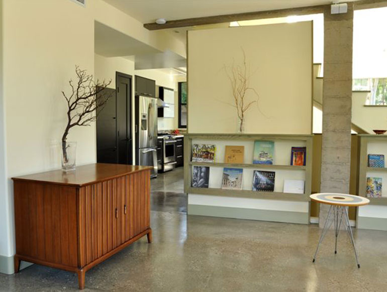
There is only one support column in the house, and it is used as a design opportunity with the stairs. In this view of the column, the board-formed poured-in-place concrete and the warm gray color of the concrete is visible.
ENERGY EFFICIENT
“We wanted to protect the home from the strong southern California sun. The home is south-bearing so we created some deep overhangs, both with the roof and with the structural slabs, to provide shade for the living and bedroom areas as well,” Simonian explained.
By utilizing the 8-inch-thick concrete in the exterior walls, Simonian said that air conditioning is seldom required despite summer temperatures around 103 degrees. That efficiency is achieved with the heat and cool transfers in the concrete during the day.
The floor-to-ceiling storefront door systems and windows are dual-glazed, low-emittance (low-E) products that add to the energy efficiency of the house. Low-E coatings are microscopically thin, virtually invisible, metal or metallic oxide layers deposited on a window or skylight glazing surface primarily to reduce the U-factor by suppressing radiative heat flow. The principal mechanism of heat transfer in multilayer glazing is thermal radiation from a warm pane of glass to a cooler pane. Coating a glass surface with a low-E material and facing that coating into the gap between the glass layers blocks a significant amount of this radiant heat transfer, thus lowering the total heat flow through the window. Low-E coatings are transparent to visible light.
“We knew we were going to save some money with energy costs and we are surpassing our expectations,” said the man who writes the check to the electric company. “It is amazing how efficient these 8-inch concrete walls are because of the thermal quality of the massive walls. During the winter, they retain the heat during the day and they just slowly dissipate it out during the evenings. So the house stays relatively warm in the winter and likewise in the scorching sun in the summer when it’s 103 degrees outside.
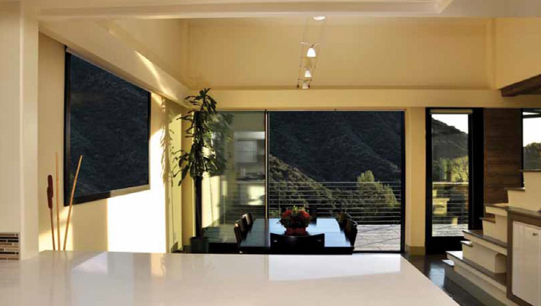
Hill and mountain trails are literally a stone’s throw away from the indoor and outdoor dining areas. This view is from the kitchen.
ONE BIG BILLBOARD
“Southern California custom homes on hillsides are typically stick construction,” he said. “It’s a shame because they end up with little 3-foot decks – balconies, really – and that’s such a shame. That’s a result of not being able to utilize and push the material to the limit to get a 12-foot overhang like you can with concrete. You just can’t do it with wood.
“Also with stick-build, they end up having small window openings not re-ally utilizing the views. These are old habits of using the same old methodologies, and not being creative enough. So this house is very unique, very different. By using concrete we were able to create something very special.
It creates strong architectural interest, and he says the house itself has been one big billboard.
“There’s not a week goes by when someone doesn’t just stop and ring the doorbell and go, ‘We love your home.’
“Or when you’re outside they will stop and ask ‘who’s your architect.’ So when I’m working outdoors now, I always have my business cards in my pocket. Chances are someone is going to stop and ask me who the architect was, and I say, ‘hey, you’re looking at him!’”
